 Worst print Best print In order to create a linotype, we first had to sketch out our idea on paper and then go over it in sharpie and white out to mark which parts of the print we wanted to be black and which parts we wanted to be white. Then, we scribbled on the back of that paper in pencil, covering all the area that has part of our sharpie/white out sketch on the other side. Next, placing the rubber pallet that we were to transfer the print onto underneath that paper, with the pencil side touching it, we traced over the sketch so as to transfer the design onto the pallet. After that, we had to then again trace the pattern on the rubber in sharpie. Then we could begin carving away the part of the image that we wanted to be white in our print. When that was all ready, we rolled out ink onto the rubber pallet and pressed a piece of paper onto the now-wet-with-ink pallet. When we lifted the paper, our linotype was complete.
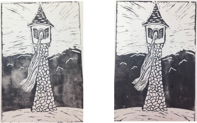
The theme of this piece was "line". I incorporated this into my piece with the lines in the girl's hair and the somewhat line-y background sky and ground. The most successful part of my piece was probably the stones on the tower. I wasn't sure how they were going to turn out when I was carving them away, but they turned out looking more like stone than I was expecting. If I could do it over, I might change the black mountains. They didn't print very well on any of my prints. Maybe it was just too much solid ink or something. I also wasn't quite sure how to make the mountains look mountainous, so I just carved some wobbly lines into them. They might have looked better if I had consulted Ms. Sudkamp or an image of mountains.
0 Comments
Leave a Reply. |
AuthorWrite something about yourself. No need to be fancy, just an overview. Archives
January 2017
Categories |
Art 1
 RSS Feed
